
FLUX | NEW TABLET DESIGN
Design Type
New product design | Tablet | Interaction Design | Hardware Control | Design System
Team
Front-end Engineers + Product Managers + Mining Industrial User Experts
Duration
2023 June - ongoing new features. Completed the first design feature within 3 months with 2-3 days a week pace to accommodate product development speed
Project Overview
FLUX is a new tablet software developed by SafeAI. A tablet inside manned vehicles for drivers to support autonomous mining-related tasks.
Goal
I’m designing interactive UIs to allow excavators to control mining haul trucks to perform autonomous loading to dumping cycle events.
My Role
In this specific project, we are designing interactive UIs to allow an excavator to control mining haul trucks to perform autonomous loading to dumping cycle events.
Results
Solo-designed new interfaces from 0 to 1
Testing, prototyping, and building design system
Increased B2B customer satisfaction

An excavator loading soil onto a mining haul truck
Understand the Product
Design for mining industry

*Understand the mining task workflow
To start the design discussion, I met with our Australia mining automation team which works directly with our customer on the product. They shared with me industrial knowledge including user groups, workflow, and product background.
I understood that we are designing a new user interface for FLUX, to allow excavator drivers to manage daily automated load and dump. Our challenge is that we currently have no UI for the product, so we are building from scratch.
Product Hardware
Hardware’s effect on user experience
Hardware: Motium tablet (Industrial vehicle standard)
Size: 8-inch touchscreen with medium responsiveness (10-inch opt)
Use location: installed on the side of the driver on the excavator
Based on the specs of the tablet, I’m well aware that I need to take greater considerations on below with ample testing:
Safety concern
Screen responsiveness
Font/button sizes
Accessibility issue


*Motium installed on the excavator
Ideation
Low-fi wireframing
Firstly I needed to decide the structure of the screen. The design needed to be flexible enough to apply to our specific use cases, but also easy to interact with on a small screen by an excavator driver. I came up with a few solutions that could be viable. Even though the wireframes are low fidelity, I think it’s a good starting point to talk about ideas without spending too much time on design, so I scanned them and presented them to the teams.
During the discussion, however, the feedbacks were not strong enough to point to a preference, so I pitched the 3rd option (side panel) as my personal preference, because it has the least amount of info for user to digest each screen, while leaving more space to the map. It also requires the fewest number of time for interaction.

Iteration
Design back-to-back with teams and users
Working with both teams in the U.S. and Australia, despite overcoming the time zone difference, our AU team opens the door for me to explore actual industrial mining operations. Every week, I will host design discussion meetings within the teams to go over all the questions, challenging designs, and new functionalities. Sometimes I also meet with experienced mining operators at night to bring their opinions to the table.

* Design iterations progress
Testing
Create own QA metrics
* Demostration of user struggling with responsiveness and button sizes
Throughout the process, I tested countless times with QA team. I designed my metrics as follows, if my design cannot meet the metrics I send myself back to iteration:
Safety (UI requires the least amount of recognition to eliminate user errors, the job should require low training, the user only needs to do simple interactions for the task),
Interaction (size, to bring frustration to the minimum),
Disability (I have to put the user in the worst-case scenario in terms of mobility/conditions, for example, the user wears gloves, big/slippery thumb, poor screen responsiveness, poor weather/dark environment), poor eyesight, arm unable to reach the screen, busy operating vehicle/attention deficiency
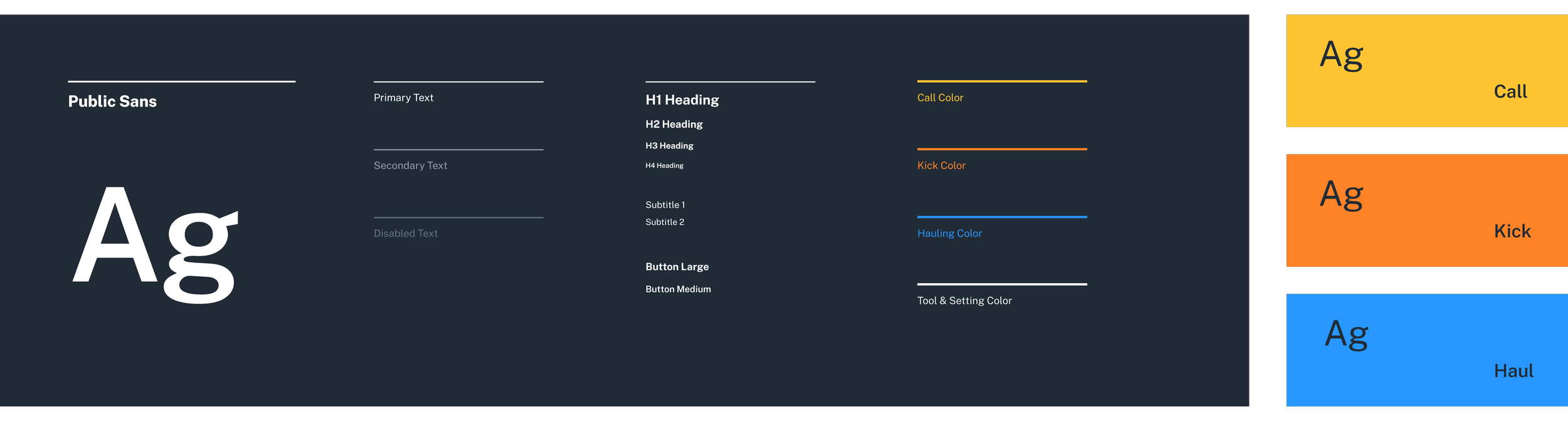
Branding
Color skeme & type
The colors I chose are highly visible under dark mode but won’t hurt the eyes. Font color, size, and weight must pass the accessibility test on a tablet screen size. Our customers from countries like Australia have stricter laws and standards on WCAG.
Feedbacks & Improvement
Yes but.
Aesthetically, the smaller font looks cleaner working with space, however, when our screen is already small, the smaller text can be easily overlooked, and trigger eyestrain, especially when the user is tired during the operation. In my opinion, we cannot give up safety over appearances. Therefore I enlarged the font with better contrast.
Colorblind: just using color to present icons poses some feedback as they are concerned it’s not friendly to color-blind users. We have an engineer who has a friend who is color blind, so after consulting him, we decided to not only use the red/green color but also a different icon to present the faulty state.
Solution
Final design
Design system
As no UI library existed before I started the project, a design system became needed to speed up our development process. When the project started I wasn’t planning to build one, as we focus on MVP with other teams to achieve our goals. However as I was working with front-end engineers, the system seemed to be helpful to onboard engineers and update designs.

Impact
Storytelling
As a new product, our goal is to deliver to the early market and to show users that we are designing for the future. I believe we created a product
Our team successfully achieved the MVP from 0 to 1 under 6 months.
Our sales team finds the design carries strong storytelling to demonstrate features to the clients.
Existing customers are happy with the new product.
Tested users & clients stated the design is easy to use & visually appealing.
Next Up
